What Did the Wisconsin Recount Teach Us?

Computer scientists and election reform advocates trust hand counts, but election administrators do not.

I have done three video reports on the Wisconsin recount so far.  This article at Medium - summarizes what I found:

Election experts and scientists keep telling us that we need to count on paper because we can always go back and examine those paper ballots. J. Alex Halderman, a professor of computer science at the University of Michigan summed up one of the most important take-aways from the recount, “ ‘Also shocking is how unlikely states are to look at any of the paper, even in a surprising and close election like this,’ Halderman said.”

Read more...


Here are the links to the three video pieces I produced for alternet.org:

Part 1 - How Accurate are the Voting Machines? (Brown County Wisconsin)

Part 2 - Racine County Clerk Refuses to Acknowledge Problems With the Count

Part 3 - The Machines are Not Secure and Some of Them are Wireless

I encourage you to watch these pieces - you will get a much better sense of what a hand count is like than from just reading an article about it.

Recount Report 12/1/16 6am

My First Recount Report.

WI Recounts are starting today at 9am. I discuss the court ruling that said the county's don't have to do hand counts, even though the judge herself supports hand counts; Details of the 4 counties I spoke with personally; chain of custody issues; and what's ahead.

Building Momentum

We had a great conference call today with about 50 people on the line. Our focus is on making our elections accurate, secure, transparent & fair. I'm having these calls so that organizers can connect with each other and activists who want to get involved can find a group to work with. This was today's call. Information about who was on the call and how to reach them is below


We will have another call or live stream at the same time next Sunday at 3pm. 

Next week's call will feature:

Laura Pressley who has been working on cleaning up elections in Texas

Don Ford - documentary filmmaker What's Next

Today's speakers included: 

Tim Canova - Progress For All
Carl J. Romanelli - Pennsylvania Green Party
John Brakey -  Election Nightmares
Ray Lutz  - Citizens' Oversight Projects
Jim Duffett - National Election Defense Coalition

facilitated by lulu Fries'dat - Electoral System in Crisis

At Electoral System in Crisis we need people with math, research and data entry skills  - please let us know if that's you - by entering your email here:  Holler Back - [not] Voting in an American Town. Please also enter your email if you'd like to just stay in touch or know about upcoming calls and events.

I will send an email with how to contact organizers directly.

Emily Levy from Elections at Risk says they are creating a list of projects that people can volunteer for. If you need help, send her information about your project: info @ electionsatrisk dot org.

Thanks so much to everyone who participated!! Take action now. Please put any comments or questions you had from the call into the comments. Thanks again!


Getting Together

If you've ever been interested in repairing our broken elections... now is a great time to get involved. If you're already involved - let's increase our effectiveness and momentum! How do we get inspired and connected? Maybe you have some ideas. Could you leave them in the comments? Here are some of my ideas.

Step 1) If you haven't done so yet, make cleaning up our broken elections your number 1 political priority. Whatever issues you care about, improving our elections will improve their chance for success. 

Step 2) Watch the film I've made outlining many of the issues that need to be repaired. Even if you know a lot about elections - I think you'll be pleasantly surprised by the depth of information on electronic equipment, hand counts, third party candidates, and public funding of elections. Bev Harris said, "I was blown away." And it's fun. 

Step 3) Leave your email here so that we can stay in touch. 

In the coming days, I'll be be sending out an email with some of the ideas people have generated, and some of mine. I also am planning to start a national conference call to focus on coordinating election integrity groups and better implementing their ideas. In my opinion the most important priority is that we have confidence that the vote counts are accurate, and the best way to do that is with #HandCountedPaperBallots - the system used in most democracies around the world. There are a lot of amazing people working in the election integrity movement and if we can get coordinated, this can a time of deep reform.

Affidavit Ballot - [not]

This is my voter registration information. I brought it with me to the polls. I am registered to vote and voted at this location in the primary. 

When I went to check in, the man did not find my name in the book. He immediately told me to vote with an affidavit ballot. I said I was registered to vote and did not want to vote with an affidavit ballot, I started filming at which point I was told I would be escorted out by the police and not allowed to vote at all.

It is wrong that we are not allowed to film inside polling places. The act of voting is supposed to be transparent and provide confidence in the outcome. It take place in the public civic space. We are video taped in every bodega, but our voting procedures are secretive and shady with practices that can affect anyone's right to vote at any time and can also affect the results.

AN UNPREDICTABLE, HIGH-STAKES ELECTION


THE INCUMBENT AND THE CHALLENGER


On August 30th incumbent Florida Congresswoman and former Democratic National Committee chairwoman Debbie Wasserman Schultz faced a tough primary challenge. Her opponent, Nova Southeastern University law professor Tim Canova had managed to focus the national outrage against her following her forced resignation as chairwoman of the Democratic National Committee, and made the election a referendum on her politics, policies and ethics.


Tim Canova


Her DNC resignation followed revelations that Wasserman Schultz and other Democratic party officials were “conspiring to sabotage the campaign of Senator Bernie Sanders of Vermont." After Sanders lost the Democratic presidential primary, some considered this congressional district a proxy race, with Sanders endorsing Canova against his rival Hillary Clinton's long-time ally Wasserman Schultz. Canova translated that endorsement into a fundraising bonanza, sparking national attention by raising over 3 million dollars. Open Secrets, a non-profit that tracks money in U.S. politics, says that 100% of those donations were from individual contributions, although according to the Sun Sentinel ninety percent of the money was from outside Florida, and may not have translated into local votes.

It was a campaign of firsts: Canova’s first run for office; Wasserman Schultz’ first ever primary opponent after 6 terms in Congress, and the first time a new district map was in place.  The 23rd Congressional District, which lies primarily in Broward, but also has some precincts in Miami-Dade County, was redistricted in 2015 as part of a court order that found that the districts were being drawn to favor Republicans and incumbents. 

The stakes were high for both candidates and the outcome was hard to predict.


Debbie Wasserman Schultz with President Obama photo by Susan Walsh | AP


Wasserman Schultz rallied her supporters starting at the very top. President Obama endorsed her; Democratic Presidential nominee Hillary Clinton personally stopped by her office; Gabrielle Giffords appeared with her at an anti-gun violence event; civil rights legend Congressman John Lewis walked her across a bridge; and Vice President Joe Biden shared an ice cream moment with her saying, “She’s my favorite person.”  But Canova adopted many of Sanders’ signature issues, and Sanders’ supporters were hungry for a new candidate.

“Gibson Lopez, 18, of Davie, attended Canova’s primary night party ... Lopez, who wore a ‘Berniecrats’ T-shirt, told Canova that he was the second person he ever voted for, after Sanders.” (Quote from the Sun Sentinel.)

There was one independent poll published during the race. The South Florida Sun Sentinel/Florida Atlantic University poll released nine days before the election had Wasserman Schultz ahead by 10 points. Not surprisingly, the candidates had starkly different perceptions of their odds. Canova's team put out an internal poll a month before the election that aligned with the Sun Sentinel's numbers. It showed Wasserman Schultz ahead by 8 points, but vulnerable with what the pollsters described as, "...a staggering decline from her popularity in past campaigns." Canova’s deputy campaign manager said that based on door to door canvassing they had done the last four weeks before the election, he thought it was going to be neck and neck. “We were identifying our supporters to her supporters five to one,” he said in a phone interview." In contrast, an internal Wasserman Schultz poll of 400 likely primary voters commissioned by the Patriot Majority PAC, showed Wasserman Schultz ahead by 33 points a month before the election. The Patriot Majority numbers were not representative of the Sun Sentinel poll. Florida Atlantic University professor Kevin Wagner, who helped conduct the Sun Sentinel poll, commented that the Wasserman Schultz survey, “...didn’t reflect what we came out with.”

On election night, Wasserman Schultz was announced the winner by a commanding lead of 13.5%. However, we have examined statistical analysis of the race from four separate analysts and after detailed demographic research have concluded that there are red flags that deserve further investigation.


STATISTICAL ANALYSIS OF THE RACE: “IMPLAUSIBLE”


In our analysis we use a method called the "Cumulative Precinct Vote Tally Chart," (CVT graph for short.) For detailed information on this type of graph please refer to our paper, An Electoral System in Crisis. Here is a brief description of the method:

The CVT graph shows the precincts added together cumulatively from the smallest precinct (the one with the least number of votes) to the largest precinct (the one with the most votes) along the X-axis (the horizontal line on the graph). On the Y-axis (the vertical line on the graph) it shows the average of each candidates’ percentage so far. Figure 1 shows a CVT graph with an expected statistical pattern. 

To visualize how the graph is created, imagine the precinct with the least votes, then picture adding in a precinct with slightly more votes, then add in one with slightly more. Continue doing that until all of the vote have been added together. Each time a new precinct is added in - the total of the votes so far is charted on the X-axis and each candidates' percentage - of the votes so far - is graphed on the Y-axis. In the end, there is a graph that shows whether or not the candidates' percentages are changing from small to large precincts, and if so - by how much. 

Figure 1 - The Republican Congressional primary in the 23rd district follows the expected statistical pattern.


The precincts are being added together cumulatively, so as you move further right on the graph, it becomes harder and harder for any individual precinct to overcome the average percentage of all the votes that have been added up so far. Because of that, after enough votes have been added in, we expect the data to begin to graph as a flat line. Figure 1 shows a graph of the Republican counterpart to the Wasserman Schultz/Canova race. This race follows the expected statistical pattern. Once enough votes are counted, the average level of support for each candidate is clear, and the graph settles into a relatively flat line. The more votes counted, the flatter the line becomes. This behavior is predicted by the law of large numbers, a mathematical principle that is the basis for all polling. Investopedia provides an easy to understand explanation for it, “A principle of probability and statistics which states that as a sample size grows, its mean [average] will get closer and closer to the average of the whole population.”

In other words - as the number of votes sampled increases - the expectation is that each candidate's percentage of support will get closer and closer to the average of their support in the whole population; exactly what happens in the Republican primary of the 23rd district (Figure 1).

In the race between Wasserman Schultz and Canova, that does not happen (Figure 2). As more and more votes are added in, instead of the pattern approaching the average level of support for each candidate (a flat line) Wasserman Schultz' percentage climbs continuously in a mathematically precise pattern, and Canova's percentage decreases steadily. We will discuss later in the post exactly how precise the pattern is. This is not the expected statistical pattern. This graph is by Anselmo Sampietro, a mathematician who holds a Master of Statistics degree from the University of Bologna, Italy. 

Figure 2 - The Democratic Congressional primary in the 23rd district shows an unexpected statistical pattern that favors Wasserman Schultz.


To realize how unusual this is, it is important to visualize what is happening during the course of the graph. Along the Y-Axis, each point is an average of the candidate's support up to that point (using the language of the law of large numbers - it is an average of the "sample" so far.) Along the X-Axis, the votes are being added together cumulatively, so by the time the final precinct is added in, the total is no longer a "sample" of the votes - it is at that point, all the votes in the race (again, using the law of large numbers language, it is the "whole population.") The far right side of the graph is then an "average of the whole population." Why does the average of the candidate's support (average of the sample as it grows larger) not grow closer and closer to the average of all the votes in the race (average of the whole population)? The average of the whole population is actually getting further and further from the average of the sample, contradicting the law of large numbers.

Four separate analysts examined the results independently and found the same trend, so there is no question that the trend exists, only a question of what it indicates. Figure 2A, by data analyst and engineer Phil Evans, shows the same graph with an estimate of the difference between the expected statistical pattern and the reported results. He estimates the difference at 10%.

Figure 2A - There is a 10% difference between the expected statistical pattern and the results in this race. 


When looking at the data, Dr. Fritz Scheuren, a member of the statistics faculty at George Washington University, said he found the results, “Potentially implausible." He continued,  "What you show are results that could have been manipulated to get to this graph.” Dr.Scheuren suggested that the best way to resolve whether there is a problem with the election is to do a manual count of the ballots. “We have to find a way to find out if they were manipulated, and that requires a recount, of at least a sample of locations.” He added that it would be best to start with precincts “where the gaps are very wide,” meaning the precincts with the largest distance in percentage between the candidates. If there are differences between the manual count in those precincts and the machine count, he recommended expanding the recount to other precincts.

Figure 3 is a graph of the precincts in the district that are in Miami-Dade County. The graph is by Dr. Beth Clarkson, a quality control engineer with a doctorate in statistics. It shows Canova’s percentage of the vote decreasing as precincts with larger numbers of votes are added in. It demonstrates that the trend exists in the Miami-Dade precincts as well as in the district as a whole.

Figure 3 - The pattern where Canova's percentage decreases as the precincts get larger is evident in both Miami-Dade and Broward County. Here the pattern is shown in the Miami-Dade precincts.


WHAT IS CAUSING THE PATTERN?


There are three general explanations for the pattern.

  • It could be caused by an error in the computation of the results.
  • It could be due to demographic differences between the precincts. If the larger precincts had a much larger representation of a group that supports one of the candidates - it is possible that it could explain the increase in one candidate's percentage. The larger demographic group would need to be much larger than the actual increase, since no group experiences 100% turnout and it is unlikely that any candidate receives 100% support from a community.
  • It could be caused by manipulation of the results.


POSSIBILITY OF ERROR

It is possible that there are errors in the results. However the pattern we are examining, seems too precise to be an error.  Figure 4 shows how precise the pattern is. In this graph we have divided all of Wasserman Schultz' results by 2.5 and multiplied Canova's results by 2.5. The result is two straight lines. We are not suggesting that these are the actual results. We are simply illustrating that when the reported results are divided by a single multiplier, they create straight lines. This demonstrates how mathematically precise the pattern is, arguing against it being caused by an error. 

Dr. Clarkson, who is the chief statistician at an aviation research institute went so far as to say, "It's definitely not an error." She pointed out that the pattern has been documented consistently in too many other races to be an error. 

Figure 4 - If Wasserman Schultz' results are divided by 2.5 and Canova's are multiplied by 2.5, the result is two straight lines. This type of precision argues against the pattern being caused by errors. 


DEMOGRAPHIC EXPLANATIONS

We did extensive analysis of all the demographic data that is available from the Broward County Supervisor of Elections for this race. Most of the precincts for the district are in Broward County, so this represents the majority of precincts in this race. Figure 5 shows a graphic representation of all the demographic data that was supplied for registered voters.

Figure 5 - Cumulative analysis of all demographic groups supplied by the Supervisor of Elections of Broward County.


The only demographics that show much variation are the Black, Hispanic, White, and Other Race voting blocks. So we focused our research on those groups. 

There are demographic differences between the small precincts and the large precincts, but they are not enough to account for the pattern in the election results. Figure 6 compares Wasserman Schultz' increase with variations in the Black and Hispanic voting blocks. Black registered voters increase as the precinct size increases, but not by enough to account for the increase in Wasserman Schultz' support. The increase in Black registered voters is less than 4%, and only a small percentage of those voters turned out. (Turnout for Broward County overall is listed as 16.57% for this race.) Furthermore, the Hispanic vote decreases in the same precincts, almost cancelling out the increase in the Black vote. 

Figure 6 - Black registered voters increase in the larger precincts, but not enough to account for Wasserman Schultz' increased percentage. 


SIGNS OF MANIPULATION

The Broward County Supervisor of Elections actually provided us with even more detailed data, listing the number of eligible voters in each demographic, and the turnout percentage of each group of eligible voters. With that data, we were able to figure out how many people from each demographic group actually cast a vote. We then constructed a formula and a graph that demonstrates what percentage of the vote each candidate would end up with, depending on what percentage of the vote they received from the key demographic populations. Sounds confusing, but it's easier to understand when you look at the graphs. 

We graph the projected votes from our formula alongside the reported vote totals - to see if we can re-create the election. We were told by the candidates that Wasserman Schultz was doing well in the Black community, so we start by giving her a hefty percentage of the Black vote: 85%, as well as even or leading percentages in the other demographic categories (Figure 7). This projection does not match the reported totals. 

Figure 7 - When Wasserman Schultz receives 85% of the Black vote and 50% of the White vote, the projected race does not match the reported totals.  


In order to more closely approximate the reported totals, it is necessary to give Wasserman Schultz 100% of the Black vote, and lower her support in other demographics. This projection is closer, but still does not match the reported totals (Figure 8). 

Figure 8 - The reported totals exhibit a steeper increase from the smallest to the largest precincts than any combination of the actual votes.


No matter what percentages of the actual votes we distributed to the candidates, we were unable to replicate the reported results. If the division of the votes is close to what we started with in Figure 7 and then a manufactured 3.5% increase in Wasserman Schultz' results, and a manufactured 3.5% decrease in Canova's results are input into the graph, then the reported totals can be replicated almost exactly (Figure 9). This would seem to imply some kind of manipulation was necessary to obtain these results. It is possible that the reported results are based on demographic trends, but that those trends are being exaggerated in some way.

Figure 9 - If a 3.5% manufactured increase for Wasserman Schultz and a 3.5% manufactured decline for Canova are added to the actual votes, then the reported results can be created almost exactly.


Another possible permutation is to give Canova a higher percentage of the Black (30%) and Hispanic (55%) vote, although still giving Wasserman Schultz the lead in the Black community that both sides agree she had (Figure 10). Under that scenario, Canova would win the race, and the statistical pattern of those results looks closer to the expected statistical pattern from Figure 2A, although with a reversal of who wins the race. In this projection, each candidate finds and maintains an average percentage of support, more closely following the law of large numbers. This interpretation of the data shows Wasserman Schultz with a bump up in the precincts that are known to have a higher registration of Black voters, something that corresponds to both the the narrative from the campaign and the demographic data.

Figure 10 - With this division of the vote, the race maintains both the expected statistical pattern and the known demographic influences. In this scenario, Canova would have won the election.


We would like to mention that the Supervisor of Elections' office of both Broward and Miami-Dade Counties were helpful and provided data quickly, in a polite and friendly manner. We really appreciate their professionalism and help. 

We do not know what the actual vote totals from the race might be. We are concerned, based on the data available, that the votes that were cast may not be fully represented in the reported totals, and that those reported totals may not be accurate. 


SOLUTIONS


There is so much concern in the electorate that the system is rigged; that the elections will be, or are being hacked; that our candidates do not reflect our best possible leaders. All of these are indications that our election process is broken. The first step in fixing it would be to move to a secure, transparent election system. Our team supports: 

  • Paper ballots
  • Marked by the voter
  • With secure chain of custody
  • Hand-Counted (at the precinct immediately following the vote if possible)
  • In a transparent process that is open to scrutiny by the public and the media
  • The results of the count, along with any concerns, must be posted publicly in each precinct immediately following the count

Hand-counted paper ballots are used in most of the democracies around the world. It is an affordable, efficient solution that some U.S. counties have already implemented. We would like to see it adopted nation-wide.

This is a clip from my documentary Holler Back - [not] Voting in an American Town that shows the hand-counted process in action. 


MORE INFORMATION


ABOUT THIS RESEARCH

Is available at ElectoralSystemInCrisis.org


ABOUT ME

The blog is by lulu Fries'dat. I'm an Edward R. Murrow award-winning journalist and documentary filmmaker. My work focuses on systemic problems with our elections that discourage participation. Follow me on twitter @luluFriesdat

This is a longer bio: 

Ms. Fries’dat received a Best Documentary award for her first feature-length documentary (producer/director) Holler Back — [not] Voting in an American Town, a film that explores why more people don't vote and participate in politics. Clips are available for viewing here. Her network news experience includes editing assignments for CBS Evening News, Nightline, Sunday Morning, The Today Show, and Good Morning America. She produced and edited profiles of Democratic candidates for MSNBC, and has done long-format documentary work with NBC News and CNBC. She was on the editing team of Gideon’s Army, an Emmy-nominated documentary that follows the personal stories of public defenders in the Deep South. Gideon's Army received the U.S. Documentary Editing Award at the Sundance Film Festival and the Ridenhour Prize, fostering the spirit of courage and truth. Other film credits include Are We Not Men  - The DEVO documentary, Joe Papp in 5 Acts (PBS/American Masters)  and Slamnation by five-time Emmy winner Paul Devlin. 

DATA

Broward County results

Miami-Dade County results

HACKING THE MACHINES – COVERAGE FINALLY!

A recent spate of articles and audio programs is acknowledging that the manipulation of election results using electronic voting equipment is a distinct possibility. NPR, Wired, the Washington Post, Science Friday, and most comprehensively – an almost 9000 word article at Politico, are all reporting on the vulnerabilities of the machines that we vote on. The networks have joined the chorus with coverage at ABC, NBC and CBS. It’s a welcome sight to see this coverage, and it’s also about time. A small army of election integrity activists, computer scientists and journalists like Brad Friedman and Victoria Collier have made the point repeatedly over the last ten years; Collier most emphatically in an eye-opening 2012 article in Harper’s Magazine.

I have been one of those voices. In 2008, I released a documentary Holler Back – [not] Voting in an American Town. As part of the filming, I recorded the hack of the AccuVote-TS voting machine that is described in the Politico article. The hack is by then-graduate students Alex J.Halderman and Ari Feldman, working with Professor Ed Felten at Princeton. The documentary clip is 5 minutes long and well worth watching. It contains back and forth cuts between Halderman and a Lehigh County Pennsylvania election official, where Halderman explains how they overcame every single one of Lehigh County’s security measures.

Lehigh County Former Chief of Staff Levi Price, “We changed the passwords for each election.”

Halderman, “The password didn’t stop us for more than a few seconds.”

Lehigh County, “You have to have the technological capability of altering the software.”

Halderman,“The memory card is just a standard off-the-shelf memory card that you use in your digital camera.  The smart cards you can buy over the internet.”

Lehigh County: “We have 700 separate machines. Each of those 700 separate machines is locked with a different key.”

Halderman, “You don’t need to break all 700 locks. Because a viral attack is possible, all you need to do is infect one or a small number of machines. And then the virus and your malicious vote-stealing software will spread from machine to machine during normal election procedures.

My narration: But what if we had a paper trail for the touch-screen machines. Would that make them more reliable?

Brad Friedman, (of Bradblog.com) “There is no reason to trust a touchscreen or DRE system with or without a paper trail. Period. You can hack the paper trails as easily as you can the internal numbers.”

That was in 2008.


HACKING IS NOT THEORETICAL

Which brings me to my next point: while the coverage is welcome, there are still some problems with the current narrative.

One problem with these stories is that they all take the position that this is a theoretical issue that they are concerned could happen. From the Politico article, “’You would be hard pressed to find an example of our voting systems ever being hacked in a real election environment, as opposed to that of a hack attempt inside of a laboratory environment in which zero real world physical election processes are utilized,’ writes Kathy Rogers, a spokesperson with ES&S, in an email, and correctly so—it’s never been proven that an election was deliberately hacked.”

This is actually not true. As early as 1994, the election of Nelson Mandela in South Africa was successfully attacked through the computers. According to Peter Harris, the head of the official election monitors, "The electronic count was compromised by a hacker who went in and multiplied the vote. The electronic count was then closed down. It stopped. That's when the results stopped going to South Africa and the rest of the world." The BBC reports that, “The secret manual system saved the day.”

If hacking the voting equipment is as easy as buying a memory card and a mini-bar key on the internet, and allows one control of local, state, and federal budgets it is not hard to imagine that it is already happening. The media may suffer from a lack of imagination, but hackers do not.

Our research does not prove that elections are being hacked. But the reported totals do not look accurate when analyzed statistically, and after extensively looking for other causes, we conclude that the manipulation of the count is the most likely explanation. The data indicates this is already occurring, and has in all likelihood been happening for years in both Democrat and Republican primaries, as well as general elections.


OPTICAL SCAN MACHINES ARE VULNERABLE

One concern about the current narrative is that some security experts are recommending optical scan machines as the solution to our election security woes. Our research indicates that computerized elections with a paper trail are as vulnerable as those without.

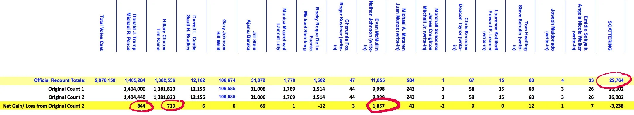
We performed a detailed statistical analysis of New York, a state that votes on paper, and then runs the ballots through optical scan machines. According to those familiar with the process, the results of the optical scan machines are all centrally tabulated by computer. In an interview Professor Halderman confirmed that central tabulation is a vulnerable security opening, where results could be assigned new percentages. “If you’re manipulating the central counting systems, then you can make an overall adjustment.” Asked whether it’s possible to get access to the central counting software, he replied, “Probably. It’s been our experience in the last decade with the Diebold systems, for instance, that it was certainly possible in the machines and counting systems we examined.”

Voting on paper is necessary, but if we want to be confident the results are accurate, it is also necessary to count the votes by hand. This is a conclusion that most of the European democracies have come to. As Ben Wofford points out in the Politico article, “Eight countries in Europe that once flirted with digital voting have seen six go back to paper; Britain counted its Brexit votes by hand.”

Below is the segment of our report showing how problematic the New York Democratic 2016 primary results are. For those who have not read the full report we found that a significant difference in the percentages that the candidates receive in small and large precincts is a cause for concern. There is no demographic explanation that is large enough to account for these variations. Furthermore, the variations are consistently helping or hurting certain candidates, ruling out random error as the problem.


New York State —

Multiple Issues Raise Serious Concerns

Evidence

If voting-machine results were inaccurate on a regular basis, there would be some evidence of it. One indicator would be that votes counted by machines would give different results than votes counted by hand. In fact, this is now being seen in elections all over the country.

In the 2016 Democratic primary in Kings County, New York (Brooklyn) a group of affidavit ballots were hand-counted by a group of volunteers. Comparing the hand-counts with the machine-counts, there is a noticeable difference (Figure 1). In every single assembly district we examined, except one, Hillary Clinton performed better when the votes were counted by machine; Sanders performed better when the votes were counted by hand. The graph shows eight of the districts that were included in the study. This is a small sample of the overall ballots cast, but the consistency of the results makes a convincing case that something is amiss.

Fig. 1 — Hand-counted ballots show

a consistently higher return for Sanders in the 2016 New York presidential primary

Graph by Anselmo Sampietro courtesy of Electoral System in Crisis


Additionally, in the 2016 New York Democratic presidential primary, the statistical patterns of certain counties are irregular (Figure 2). Richmond County (Staten Island), Kings County (Brooklyn), and Bronx County reveal a strong correlation between precinct size and candidates’ percentages. Clinton does consistently better as the precincts get larger and larger. Sanders does consistently worse. It is possible that the difference in candidates' percentages are due to demographic differences; but it is not clear what the demographic forces in these counties are that would create such a large difference in candidate outcomes between small and large precincts. Furthermore these patterns are consistent with what vote totals would look like if each vote for one candidate was being slightly inflated, and each vote for another candidate was being slightly decreased.

Fig. 2 — 2016 New York Democratic presidential primary

Richmond, Kings County & Bronx County show a strong correlation between precinct size and candidate percentage                                                                        

Columbia County, New York — a hand-counted county — offers a good point of comparison to the above graphs (Figure 3).

Fig. 3 — 2016 NY Dem pres primary

Columbia Co. - this hand-counted county has an expected statistical pattern                                                

In Columbia County, where the votes are counted by hand, candidates received the same level of support in small and large precincts. The graph shows that there is a large degree of fluctuation both up and down on the left side of the graph; but by about 1,300 votes, the graph settles into a fairly even straight line, with small, random fluctuations. It maintains a basically flat line through all of the largest precincts. This is a very normal-looking CVT (cumulative vote tally) graph. Unlike the Richmond County, Kings County and Bronx County graphs, Clinton and Sanders receive approximately the same level of support in the small and large precincts. 

The difference in candidates' percentages in small and large precincts in Kings County reinforces the findings that machine and hand counts gave different results in that county. It paints an increasingly troubled portrait of potentially compromised vote totals in Brooklyn. But there is another odd factor in the New York State results.

Precise Percentages

We are showing the New York City graphs  to illustrate a very specific point. The data supports the idea that the overall state vote totals are being massaged to achieve a predetermined percentage.

The final reported totals in New York state were almost exactly 58% Clinton to 42% Sanders. It is necessary to go to the third decimal digit to see a difference: 57.995 versus 42.005.

Doug Johnson Hatlem reported on this issue, pointing out that, “The overall results in New York, as announced on election night, deviated from a perfect 58–42 split by 0.005345. That’s 97 votes out of over 1.8 million.”

In Kings County, the reported totals were almost exactly 60% Clinton, to 40% Sanders: (59.72% Clinton, 40.27% Sanders.) The .27 difference is caused by about 800 votes out of 300,000. In the Bronx, the percentages were almost precisely 70% to 30% (69.59% Clinton to 30.41% Sanders), the difference being just 616 out of 151,908 total votes. 

New York City already had two unusual pieces of data giving cause for concern:

  • The difference between hand-counted and machine-counted results
  • Irregular statistical graphs in multiple counties

Add to that:

  • Precise percentages in the total election results could be an indication that the results have been manipulated to achieve a specific percentage for the candidates.

These are three separate but reinforcing facts, illustrating why the totals for this state are suspect.


COUNTING BY HAND - THE BEST SOLUTION

Our recommendation is

  • Paper ballots marked by the voter, counted by hand in the precinct with secure chain of custody and transparent processing that is open to scrutiny by the public and the media.

In this age of speed and automation many people cringe at the thought of sitting down at a publicly-monitored table and counting the votes one by one. But there are well-developed protocols for counting votes by hand publicly at each precinct, immediately following the close of polls. With good chain of command security, this could be a feasible enterprise. The process would be open to the media and could make for some very dramatic television – especially in a close race. People counting the votes by hand could give the networks hours and hours of dramatic air time to speculate about the possible outcomes.

Yes, it’s true, most of us use a calculator to add 17 + 24, but there are still a few things we would never want a machine to do. Would you want a machine to read a bedtime story to your child? Would you want a machine to make the final confirmation that a loved one was dead? Would you want a machine to determine whether or not we engage in nuclear warfare? After all, that is the ultimate decision we are deciding at the ballot box. Collectively we are determining who will make crucial decisions for us at the moment of crisis. It’s worth the extra time and effort to make sure we get it right.

2016 GOP Presidential Primary Shows Evidence of Manipulation

This blog post is updating information from the report, An Electoral System in Crisis. Our data indicates, that as Trump has suggested, it is likely that the vote counts were not accurate in the 2016 Republican Primary. In the large precincts Trump's percentages go down, as other candidates' percentages go up. We were unable to find a demographic explanation for this. It is possible this is an indication that the vote count is being manipulated through the electronic voting equipment in the large precincts. We identify the electronic voting equipment as a potential source of the problem, because we do not find the same suspect pattern in the hand counted precincts that we examined. The Wisconsin graph demonstrates this. Graphs by Phil Evans &  Anselmo Sampietro. @luluFriesdat For a more detailed explanation, we encourage you to read the full report. www.electoralsystemincrisis.org #ESIC

Politico: 2016 Democratic Primary Election Results Could be Off by 12.82%

Politico.com is reporting on our 12.82% estimate that the 2016 Democratic primary results could be off. This estimate is based on new data generated from our report "An Electoral System in Crisis," developed with support from Election Justice USA.

Using the statistical analysis generated in the report, we compared the expected statistical pattern to the reported vote totals. We included the 11 states that we had the most comprehensive analysis of, out of the 21 states that we examined, and came up with an average of 12.82% that the results could be off. This would potentially be enough to change the outcome of the election, especially when combined with estimates of other irregularities such as voter suppression and registration tampering that Election Justice USA has demonstrated took place.

Please look at this blog post for graphs of the estimates of two of the states, Louisiana and Illinois. We will post the entire table and more graphs tomorrow.

Here is the Politico article:

"Three Washington state delegates who backed Bernie Sanders slammed the Democratic Party on Thursday for its "manufactured" sense of unity, while circulating data from Election Justice USA that suggested there were voting "anomalies" during the primary contest.

The announcement follows their participation in a silent walk out of the Democratic National Convention on Tuesday.

“We are concerned with the manufactured ‘unity’ narrative in the media and are fighting for the soul of the Democratic Party and Democracy,” said Jessa Lewis, Jessica Justice and Joshua Trupin in their statement, citing concerns over leaked Democratic National Committee emails discussing Sanders' religious beliefs and “offering federal appointments in exchange for big donations.”

The Election Justice USA report said there were widespread statistical anomalies in at least 21 states that could be sufficient to call the results of our candidate selection process into question.” Their data shows that among the 21 states they've examined so fa, [sic] the average difference between the reported vote totals and the expected statistical pattern was 12.82 percent — a margin that could have shifted election results.

The group attributes this to faulty electronic voting technology, ultimately calling for “decertification of the 2016 Democratic primary results in suspect states” as well as a move to a hard copy voting process consisting of “universal hand counted paper ballots with secure chain of custody and transparent processing that is open to the public and the media.”

By Caroline Kelly

To those who would like to sweep this information under the carpet, and move on to the general election; we point out that one election that is based on manipulated votes, will likely be followed by another. Those who truly want their candidate to win, must come to understand this real and present danger. We recommend that supporters of all candidates work with election integrity groups, like Election Justice USA, to implement hand-counted paper ballots in as many counties as possible by November. These counts will need secure chain of custody and transparent processing that is open to scrutiny by the public and the media,

How Far Off Are the Election Results…? It Could be a Lot.

We are starting to release our estimates of the differences between the expected statistical patterns and the reported totals in the 2016 presidential primaries. These are the percentages that our research indicates the official results could be off by.

In our report, An Electoral System in Crisis, released with the support of Election Justice USA, we provide considerable evidence that the vote totals from the 2016 primaries are in all likelihood not correct, and that the most likely explanation for a pattern to have this widespread of a presence is some kind of manipulation of the totals.

Fritz Scheuren, a member of the statistics faculty at George Washington University, and a former president of the American Statistical Association agreed. Dr. Scheuren has been a collaborator in our research, and is quoted in the report. Examining the data from the study, Scheuren said, “As a statistician, I find the results of the 2016 primary voting unusual. In fact, I found the patterns unexpected [and possibly even] suspicious. There is a greater degree of smoothness in the outcomes than the roughness that is typical in raw/real data.”

We got some email questions asking what the [ ] indicated had been changed from the original quote, so here is the quote exactly as Dr. Scheuren emailed it to me.

"In fact, I found the patterns unexpected. Suspicious even?"

I am in regular contact with Dr. Scheuren who has vetted much of our data. In one of our recent phone calls, he confirmed that the analysis strongly suggests that the results are not accurate, and weighed in on how close this election might have been if the votes had been reported accurately.  He said, “It would have been a lot closer and Sanders might have won.”

In Louisiana, the data indicates the results could be off by as much as 36%.

In the graph above, we see not only an unexpected dip in Sanders percentages in the large precincts, but also an implausible dip in the percentage of all the less-established democratic candidates on the ballot. We received screen shots (below) from one of the less-established candidates Roque De La Fuente that corroborate the idea that those candidates are having their vote totals depressed, deleted, or transferred in some way. In Travis County Texas, with almost 10% of the votes reported, De La Fuente had over 8000 votes. But by the time 50% of the votes were reported his total had been reduced to 105 votes.

De La Fuente ends the race in that county with 138 votes. The race in Texas above is a tight race. Sanders wound up winning Travis county 51% - 48%. But the candidates were fighting for every vote here. So votes that may have been available from less-established candidates could have been useful.

In Illinois we see a change in the percentages in the large precincts, so great that the winner of the race would be reversed if the percentages from the small precincts were maintained in the large precincts. This suspicious increase of Clinton's, and other candidates' percentages in the large precincts, is the thrust of our research. We were unable to find a plausible demographic explanation for its presence in state after state. The analysis indicates that the results could be off by as much as 9% and that in this state, it would be large enough to change the outcome.

There are many other states that had suspect patterns this large or larger. We will be releasing more graphs soon.

Dr. Scheuren and I discussed what actions need to be taken in regard to this data. He suggested, "At least two states where these issues are evident should be manually counted – if there’s a meaningful difference between the official count and the recount, then maybe more states should be counted," and he emphasized again, "because it could change the outcome.”

As Hillary Clinton said tonight, "Our democracy isn't working the way it should."

NEVADA DEMOCRATIC CAUCUS - 2 SIDES

CNN spent a lot of time last night on what they described as the crude, disrespectful and incendiary behavior of Sanders supporters at the Nevada caucus.

"'I was not able to stop these people for doing what they did,' Boxer, a Hillary Clinton supporter, told CNN. "Apparently they've done it before. .... This group of about 100 were very vocal, and I can't describe it -- disrespectful doesn't even explain it, it was worse than that."

Boxer is hardly the lone Clinton supporter to experience such harassment on the campaign trail. Several top Democrats told CNN publicly and privately that the energy and enthusiasm of Sanders supporters has at times descended into incendiary attacks that threaten to tear apart efforts to unite Democrats against Donald Trump. Several female senators told CNN the attacks have been misogynistic."

Behind the Scenes in Nevada

However if you read Tom Cahill's post from April 3rd, you'll get a very different impression of what was going on. He describes behind the scenes maneuvering to leave Sanders representatives out of the loop, and attempts to remove credential committee chair Christine Kramar behind her back for providing Sanders team with equal information. This led to a standoff where Kramer sat down on the floor in protest. The video has 85k hits on YouTube. At the bottom of the post, you see the entire floor erupt in cheers when Sanders wins.

Reminds me of the John F. Kennedy's quote, also used in a speech by Martin Luther King, Jr. “Those who make peaceful revolution impossible will make violent revolution inevitable.”